June 12, 2025
Year
2025
Client
self
Category
Branding
Product Duration
1 Week
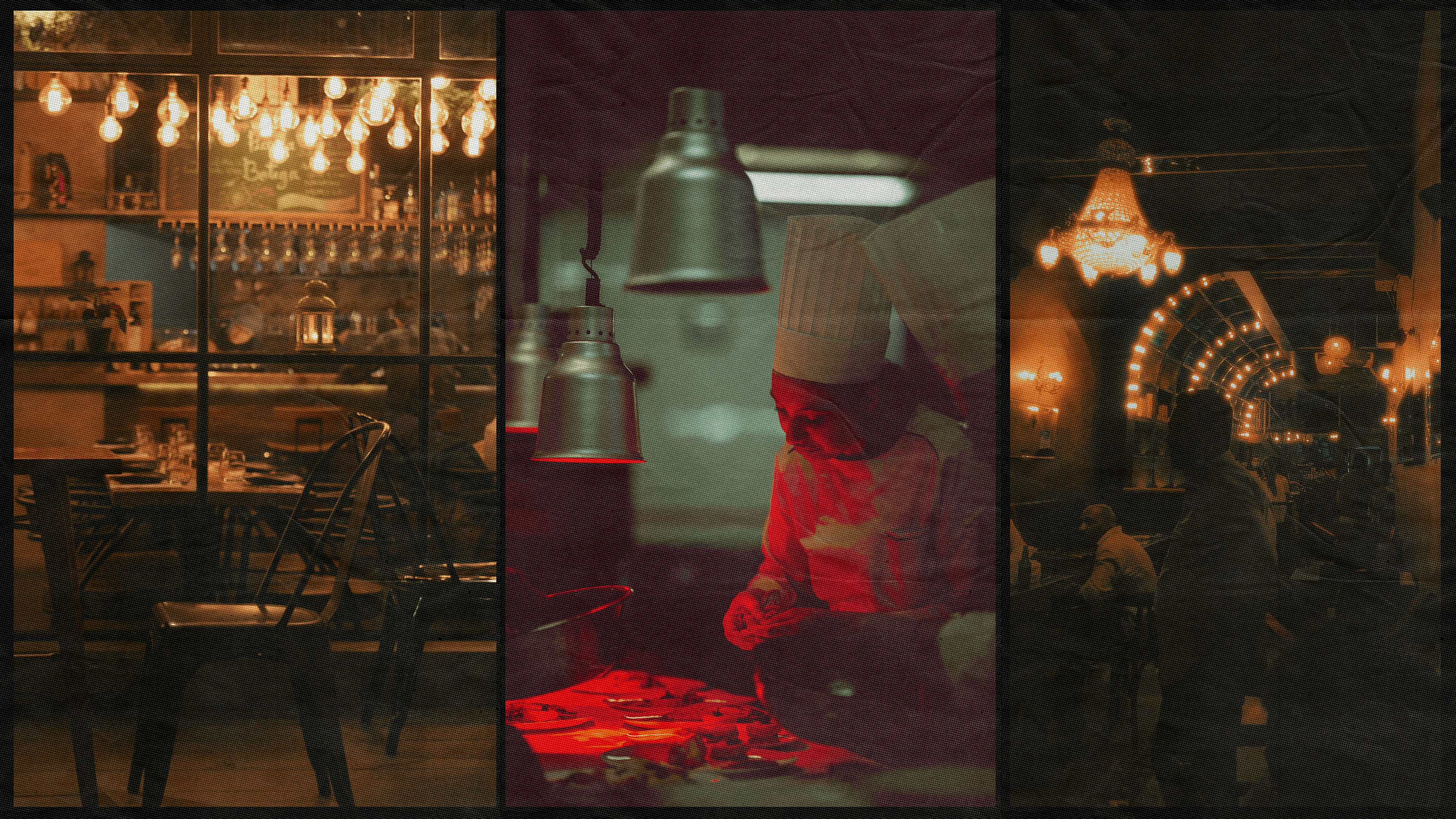
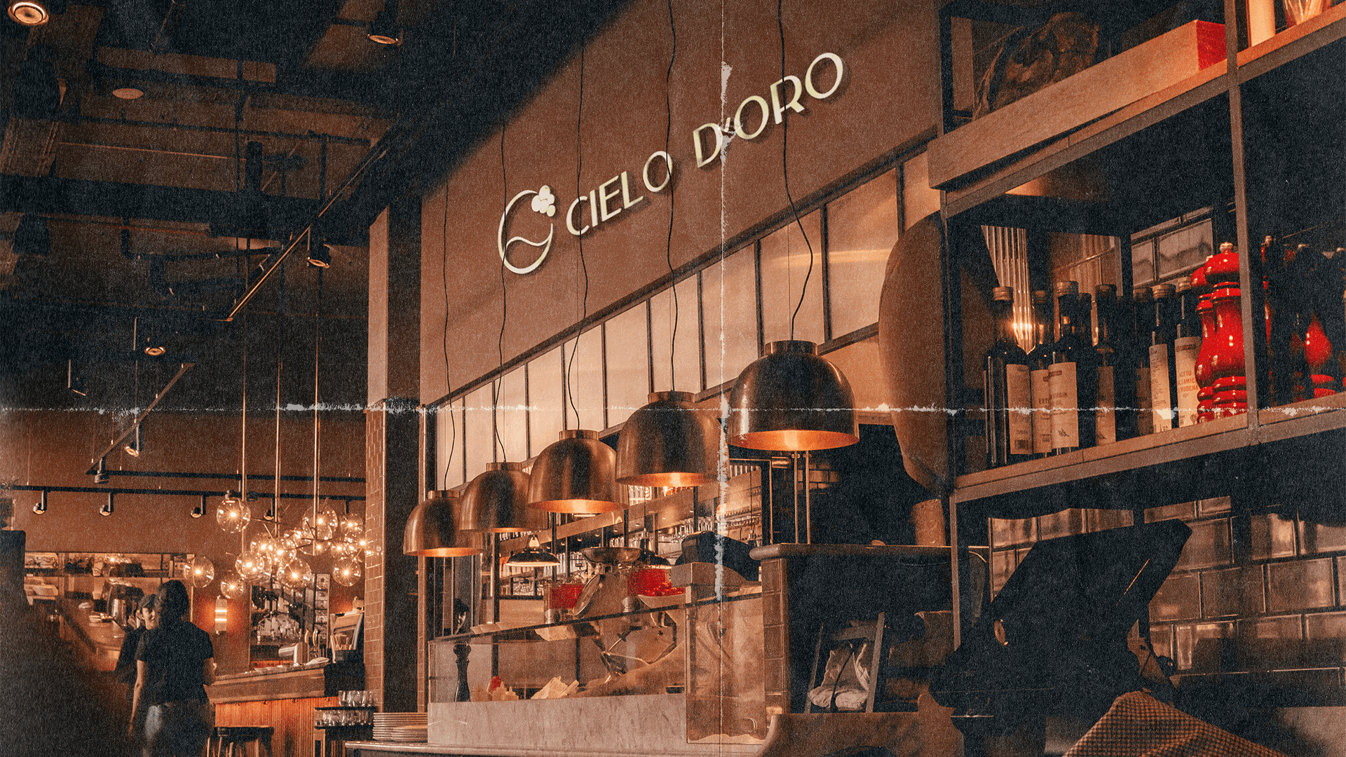
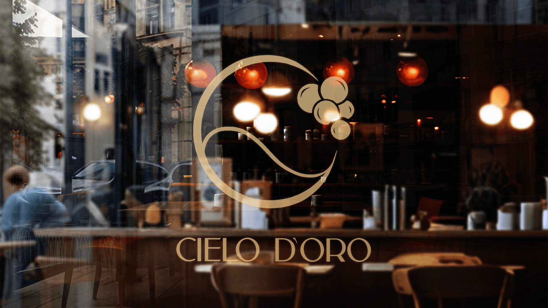
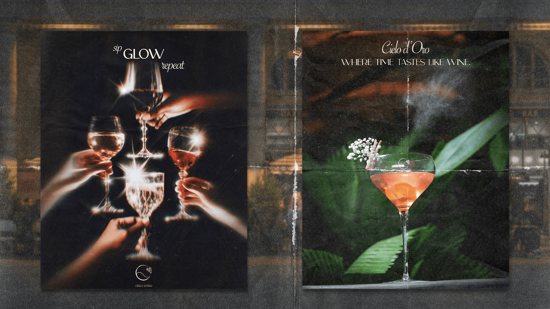
Cielo d’Oro is a branding project inspired by the quiet poetry of golden hour. Built around themes of memory, presence, and softness, it reimagines the identity of an Italian culinary space not just as a restaurant — but as a feeling. The name itself, meaning “Sky of Gold,” reflects the brand’s goal to slow time and evoke warmth through every detail.
The visual language is grounded in soft color palettes, gentle contrasts, and elegant typography. Layouts are spacious and uncluttered, creating room for visual breathing. From the gold-accented logo to textured paper mockups, every design choice is meant to feel tactile, slow, and timeless — just like a quiet evening in an Italian village.
More than aesthetics, Cielo d’Oro represents a mindset: presence over pressure, elegance over noise. It’s about making space for meaning in design — where branding doesn’t scream, but gently settles into memory. The brand encourages stillness, reflection, and connection, both visually and emotionally.
In a world of fast visuals and short attention spans, Cielo d’Oro offers a pause. A moment to feel, to notice, to remember. This project is a reminder that branding can be quiet — and still deeply powerful. It speaks softly, but leaves an imprint that lingers.